
A new year, a new iPhone, and once again you’re probably wondering if it’s worth upgrading this year or waiting one or two more years to get something that will have a bit more staying power. Last year, it was pretty easy to recommend you wait for another cycle to upgrade, but this year the promise of a 48-megapixel camera and a new Dynamic Island instead of the notch are rather tantalizing.
So, is it worth it?
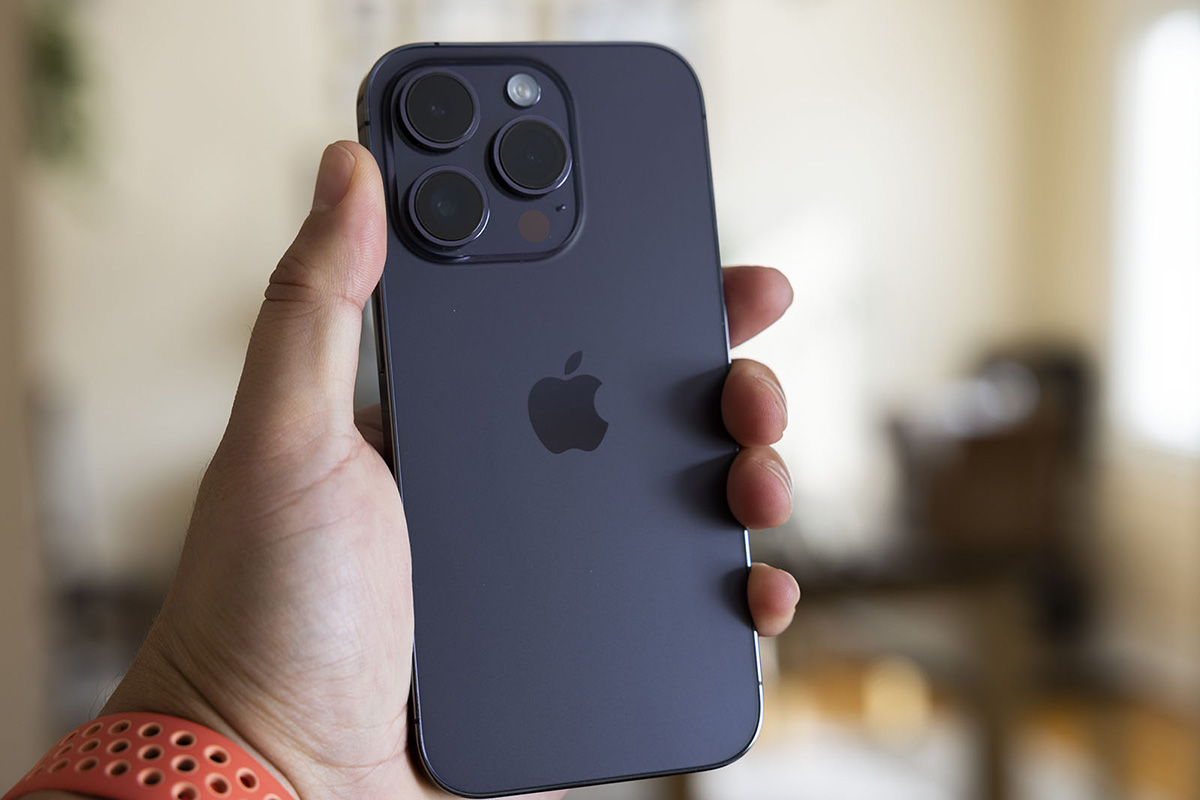
As you might expect, there are scant few visual differences between the iPhone 13 Pro and iPhone 14 Pro, but just enough was done to the physical dimensions to make it so that last year’s cases won’t fit on this year’s phone. That annoyance aside, I kind of appreciate how similar the phone’s design is since, well, I’ve gotten really used to it. Replacing one with the other was a pretty seamless transition, and there is something to be said about that.

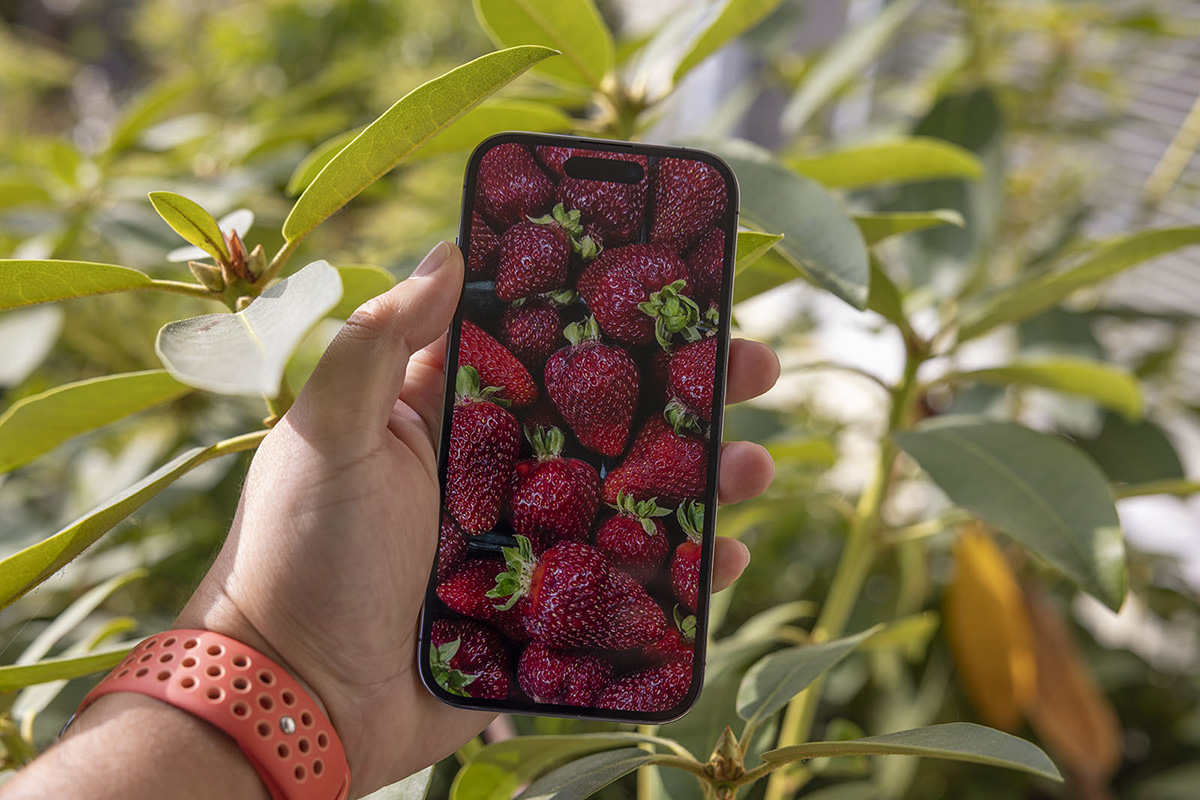
Apple did unlock more brightness for the iPhone 14 Pro over last year’s model and I will say it is noticeable. The new Super Retina XDR Display, as Apple calls it, is a custom OLED that has a huge 1,600 nits of peak brightness when displaying HDR content — which is more than twice as much as the TV in my living room — and a ridiculous 2,000 nits outdoors. I never actually thought my iPhone 13 Pro was dim, but since moving to the 14 Pro, I have an appreciation for how bright it can get.
The actual quality of what I’m watching on my phone is probably better with the iPhone 14 Pro, but to be honest I didn’t really notice. I’ve felt that the visual quality has been pretty fantastic for several years now, and that certainly is not any different with this year’s model. The display also can dynamically adjust between 10Hz and 120Hz depending on what is being displayed so that it is more power efficient, though this feature isn’t new to this year’s model.

Another change is that the iPhone 14 Pro has the option for an always-on display, which is enabled by default. I used this for the first couple of days before turning deciding I didn’t like it, and now I just let my display be off. I have an Apple Watch with an always-on display and there, I get it. Sometimes you need to quickly glance down to see the time and flicking your wrist just right or tapping the display doesn’t really feel like a watch experience. But a smartphone? It feels like something I don’t need and while Apple says it won’t be a major drain on your battery, I didn’t see the point in having it be a drain at all.
The only huge, noticeable change is the new Dynamic Island that houses the Face ID sensor and the front-facing camera. I really liked how Apple showed that it could be used and honestly, in a select few circumstances, I think it’s a big improvement over how the operating system worked before. When doing a Face ID check, no longer is the whole screen dominated by the animation, for example.
For the most part, I rarely see the Dynamic Island playing a role in my day-to-day usage. I have a tiny dog that walks on top of it while I’m browsing Reddit through Apollo, but that’s about it. None of my other apps have found a fun way to use this feature yet, though I assume that will change as time goes on.
What I will say is that by adding a strip of screen above the ovular hole punch that is the Dynamic Island has made it ever so slightly harder to tap the very top of my screen and auto-scroll to the top of a page. As maligned as the “notch” was on the iPhone 13, at least it was a pretty big target. These days, I find myself fumbling a bit just to get it to recognize that’s where I’m tapping. A small nitpick, to be sure.
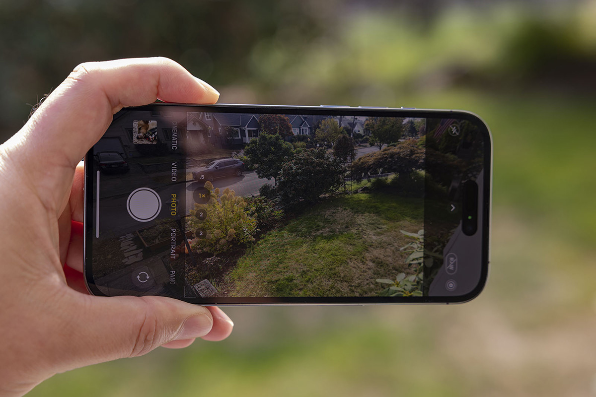
More than anything, here at PetaPixel we care about the cameras. Each year, Apple says it has made the best iPhone camera ever, and this year that means boosted resolution in the main camera, more capture options, better low-light performance, and more zoom choices.
The biggest change to the iPhone 14 Pro’s camera is the addition of a new 48-megapixel quad-pixel main sensor that Apple says enables better photos and new features like an additional 2x telephoto for a total of four zoom options. While the main camera is obviously the main star of the show, Apple says that all the cameras have received a boost in low-light performance thanks to a new Photonic Engine.

The flash has also been redesigned with an array of nine LEDs with what Apple calls “adaptive” behavior. I’m sure this is helpful, but it’s still flash and I’m not a fan of any key light that is coming from the exact angle direction as the main camera, which is why on-camera flash has never been my thing.
If there is one takeaway I want you to come away from this review with, it’s that Apple has cracked the code when it comes to outstanding photo quality in ideal conditions. In bright, sunny light, the iPhone 14 Pro’s main camera is a marvel. By default, the phone uses all that 48-megapixel data and packs it into a 12-megapixel final image, which results in some of the most exceptional pixel quality I’ve seen out of a smartphone and the best-looking images I’ve ever seen out of an iPhone by far.
We’ve been inching closer and closer to full-size camera quality in a smartphone and while Canon, Sony, Nikon, Fujifilm, and the like are all pretty safe when it comes to a combination of resolution and quality, Apple is probably going to start making them sweat. Apple seems to understand that you can cram a lot of megapixels in a smartphone, but that doesn’t necessarily make a good camera. It’s why I’m not impressed when I see a 200-megapixel smartphone announced, because I’m not convinced that the use of those pixels is going to be great. Here, Apple shows that with just 48 megapixels, it is able to create a finished 12-megapixel photo that I would swear was taken on a full-size camera if I didn’t know better
Previous:The iPhone 14 is coming; here’s every new feature
Next:None